Tabs and Accordions
Why Using Tabs and Accordions Correctly Matters
We want to create the best user experience possible. It matters especially when a user finds your page through a search result. Google will crawl your page content and will include accordion and tab content in a search result, but if the content the user was searching for is in a closed panel/accordion, they may have trouble finding what they expected. If the panel headings are specific (having a high "information scent") and the guidelines below are followed, a user should easily identify the category containing the information they were looking for.
Using Accordions the Right Way
Accordions are a useful pattern for progressive disclosure — highlighting important details of a section and revealing more details upon a tap or click, if necessary. As a result, the design stays focused and displays critical information first, while everything else is easily accessible.
-Smashing Magazine
Accordions function with a panel heading, and panel content that is revealed upon clicking. It is important that your accordion panel headings have a high information scent, ie, they should contain enough information for the user to understand the content that will be revealed.
- Accordions should only contain specific information relevant to the header, like a word in a dictionary is relevant to it's definition. The content in accordions should always be concise. Large amounts of information should be deemed important enough to become their own page, and if not important, consider removal.
- Do not use ALL CAPS for tab labels. ALL CAPS is rarely a good idea because it's harder to read.
- Plain language should always be used (no technical jargon or acronyms).
- Accordion headings can be longer and be more descriptive, like a short sentence.
Tabs should never be placed in accordions
Creating an Accordion
To create an accordion table:
- create a table (In order for this to display correctly you must have two columns in your table)
- add one row per accordion item
- go to table properties
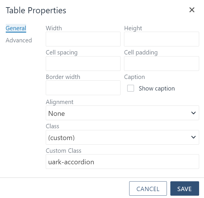
- set class to custom,
- in the custom class field put uark-accordion as shown below.
The leftmost column in the table will become the accordion heading and the column directly to the right will become the content of each accordion.
Note: If you ever need to delete one of your accordion entries simply delete the corresponding row in the table.
Basic Accordion Example
Using Tabs the Right Way
A tab is a design pattern where content is separated into different panes, and each pane is viewable one at a time. The user requests content to be displayed by clicking the content’s corresponding tab control.
-Smashing Magazine
Tabs should be used to display items that are all relative to the same topic.
- Use tabs to alternate between views within the same context, not to navigate to different areas. This is the single most important point, because staying in place while alternating views is the reason we have tabs in the first place.
- Logically chunk the content behind the tabs so users can easily predict what they'll find when they select a given tab.
- Use tabs only when users don't need to see content from multiple tabs simultaneously. If people do need to compare the info behind different tabs, then having to switch back and forth puts an added burden on their short-term memory, increases cognitive load and interaction cost, and lowers usability compared to a design that puts everything on one big page.
- Write short tab labels and use plain language, rather than made-up terms. Tab labels should usually be 1–2 words. Short labels are more scannable; if you need longer labels, it’s a sign that the choices are too complicated for a tab control.
- Do not use ALL CAPS for tab labels. ALL CAPS is rarely a good idea because it's harder to read.
- Make sure to limit the number of tab items for mobile consideration.
Accordions should never be placed in tabs
Creating a Tab
To create a Tab:
- create a table (This table must have two columns)
- add one row per tab item
- go to table properties
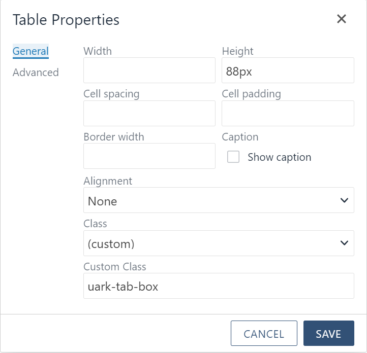
- set class to custom
- in the custom class field put uark-tab-box as shown below.
- right click the first cell in the first column (the entries in this column will become your tab titles)
- go to cell properties
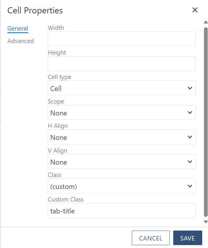
- set class to custom
- in the custom class field put tab-title as shown below. (This will need to be done for each title cell)

- then right click the first cell in the second column (the entries in this column will become your tab content)
- go cell properties
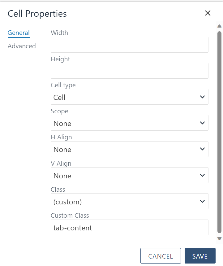
- set class to custom
- in the custom class field put tab-content as shown below. (This will need to be done for each content cell)

After this your tabs should display correctly.
Note: If you ever need to delete one of your tabs simply delete the corresponding row in the table
Basic Tab Example
Tab Content 1.
Lorem ipsum dolor sit amet, consectetur adipiscing elit, sed do eiusmod tempor incididunt ut labore et dolore magna aliqua. Ut enim ad minim veniam, quis nostrud exercitation ullamco laboris nisi ut aliquip ex ea commodo consequat. Duis aute irure dolor in reprehenderit in voluptate velit esse cillum dolore eu fugiat nulla pariatur. Excepteur sint occaecat cupidatat non proident, sunt in culpa qui officia deserunt mollit anim id est laborum.
Tab Content 2.
Lorem ipsum dolor sit amet, consectetur adipiscing elit, sed do eiusmod tempor incididunt ut labore et dolore magna aliqua. Ut enim ad minim veniam, quis nostrud exercitation ullamco laboris nisi ut aliquip ex ea commodo consequat. Duis aute irure dolor in reprehenderit in voluptate velit esse cillum dolore eu fugiat nulla pariatur. Excepteur sint occaecat cupidatat non proident, sunt in culpa qui officia deserunt mollit anim id est laborum.
Tab Content 3.
Lorem ipsum dolor sit amet, consectetur adipiscing elit, sed do eiusmod tempor incididunt ut labore et dolore magna aliqua. Ut enim ad minim veniam, quis nostrud exercitation ullamco laboris nisi ut aliquip ex ea commodo consequat. Duis aute irure dolor in reprehenderit in voluptate velit esse cillum dolore eu fugiat nulla pariatur. Excepteur sint occaecat cupidatat non proident, sunt in culpa qui officia deserunt mollit anim id est laborum.
Tab Content 4.
Lorem ipsum dolor sit amet, consectetur adipiscing elit, sed do eiusmod tempor incididunt ut labore et dolore magna aliqua. Ut enim ad minim veniam, quis nostrud exercitation ullamco laboris nisi ut aliquip ex ea commodo consequat. Duis aute irure dolor in reprehenderit in voluptate velit esse cillum dolore eu fugiat nulla pariatur. Excepteur sint occaecat cupidatat non proident, sunt in culpa qui officia deserunt mollit anim id est laborum.
Cited Sources:
Jacob Nielsen. “Tabs, Used Right.” Nielsen Normal Group, July 9, 2016, www.nngroup.com/articles/tabs-used-right.
Vitaly Friedman. “Designing The Perfect Accordion” Smashing Magazine, June 21, 2017, www.smashingmagazine.com/2017/06/designing-perfect-accordion-checklist.
Jacob Gube. “Module Tabs in Web Design: Best Practices and Solutions” Smashing Magazine, June 24, 2009, www.smashingmagazine.com/2009/06/module-tabs-in-web-design-best-practices-and-solutions.

